Features components for Material UI
High-quality Features components
built with Material UI and React.js
Features in two-column grid
Get the code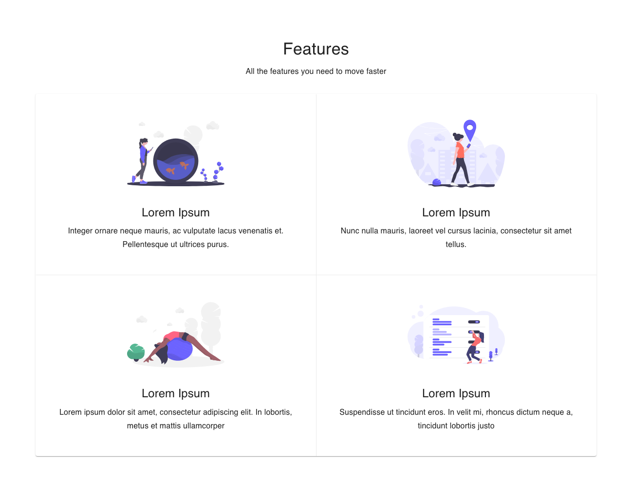
Features with alternating rows
Get the code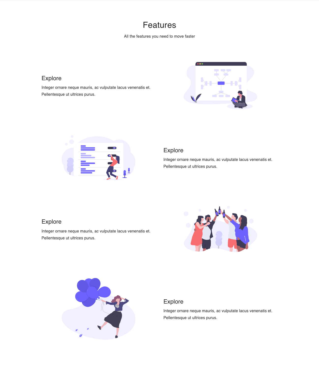
Features row with icons
Get the code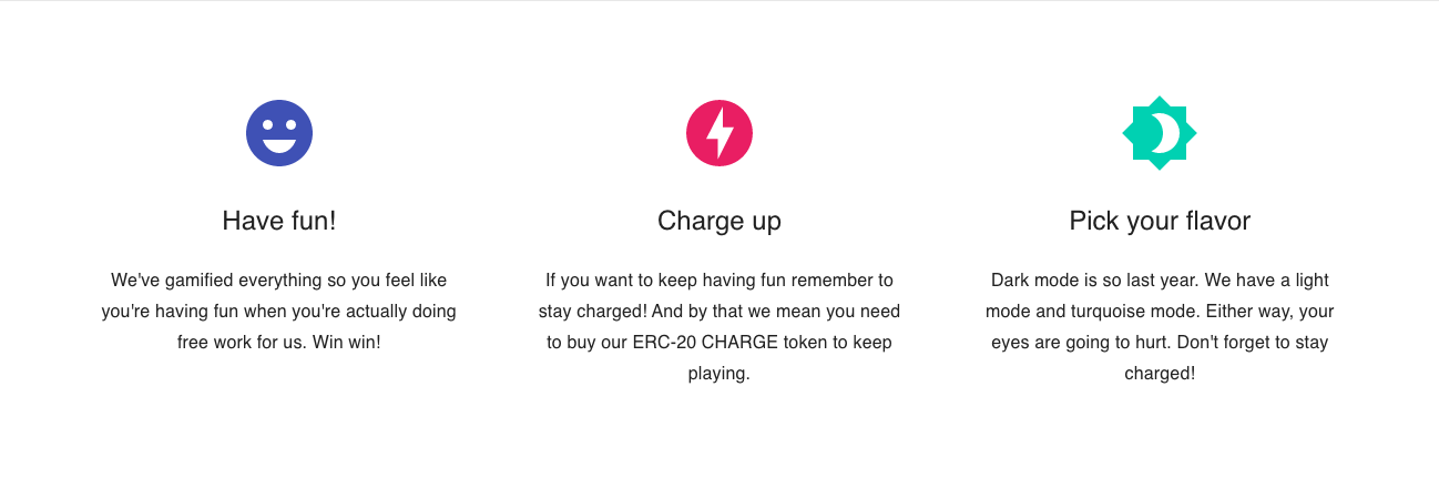
Features with image on left
Get the code
Get the code
You can get the code for this component in our React and Material UI Boilerplate. You'll get a complete React codebase with Material UI integration, a beautiful multi-page template, additional integrations if you need them (like auth and payments), and access to our entire Material UI component library.

 Twitter
 Facebook
 Linkedin
 Discord