Tailwind Component Library
High-quality components
built with Material UI and React.js
Navbar with row of links and fancy dropdowns
Get the code
Hero with buttons, large image, and decorations
Get the code
Hero with logo, dark background, buttons, and large image
Get the code
Hero with logo, feature icons, and three column info grid
Get the code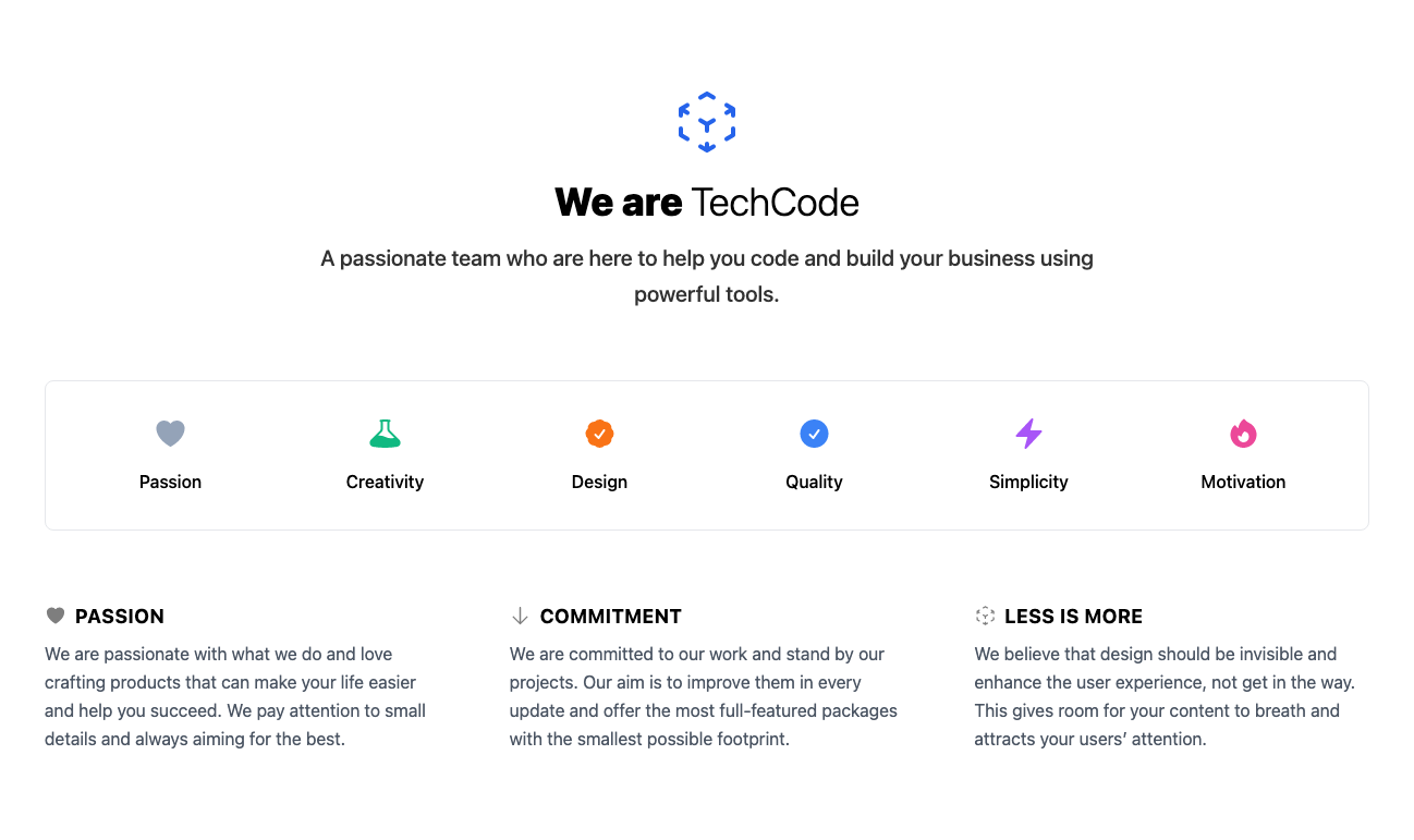
Hero with logo, two column image grid, and three column info grid
Get the code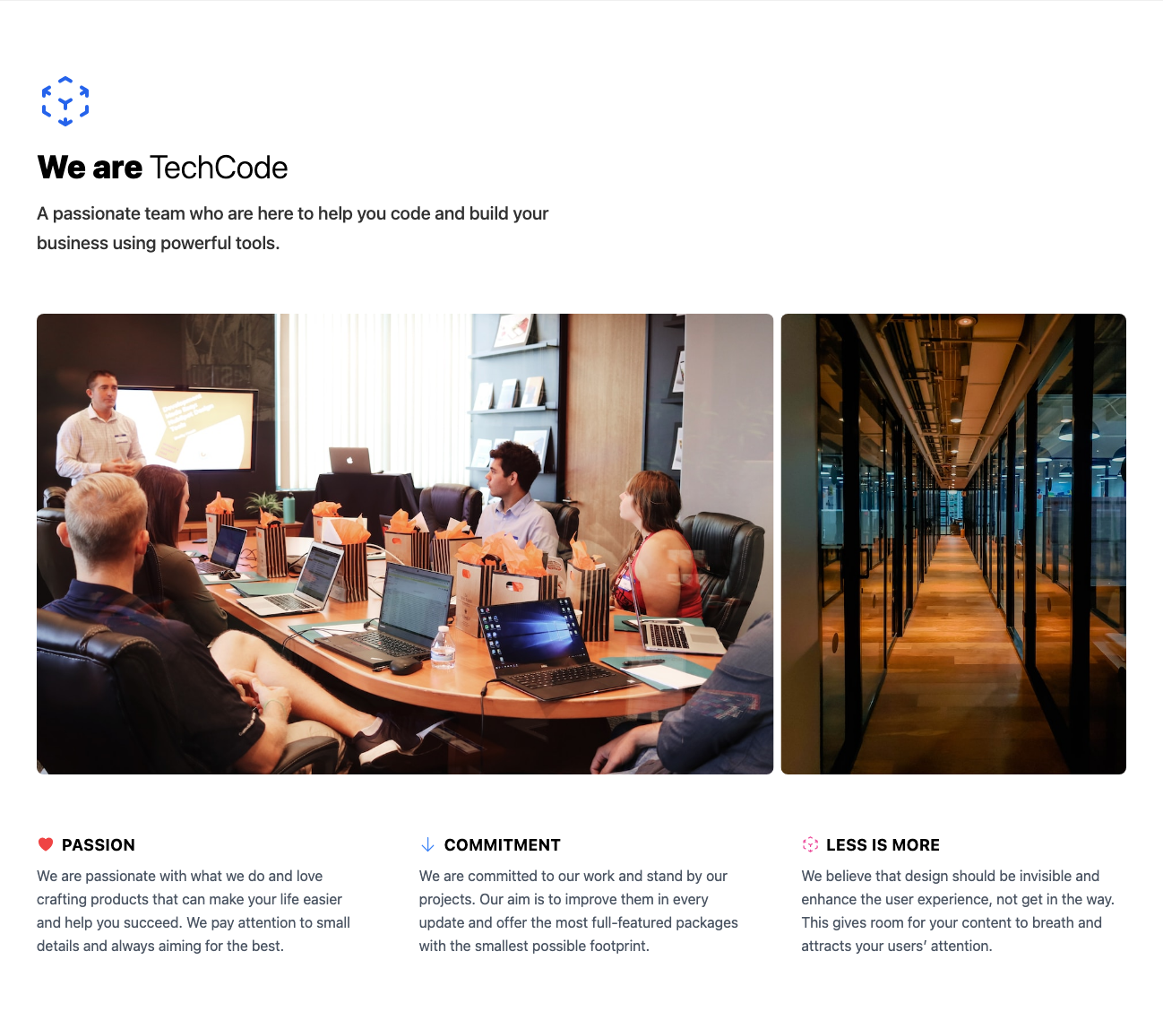
Call to action with logo, description, and centered button
Get the code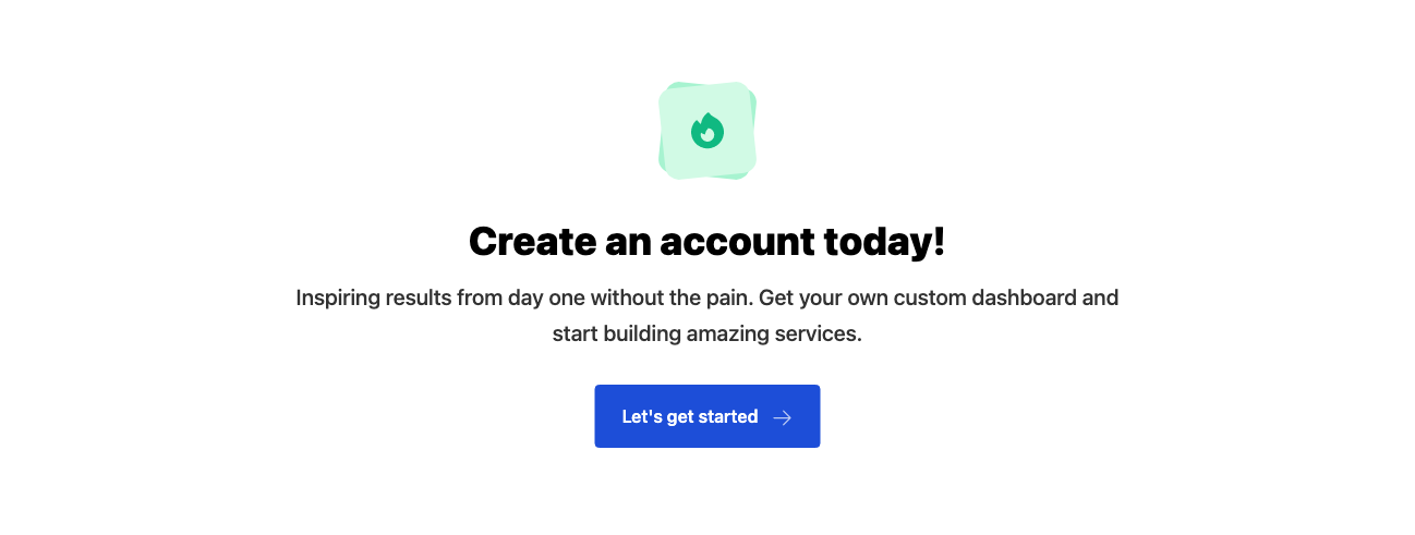
FAQ with two column grid
Get the code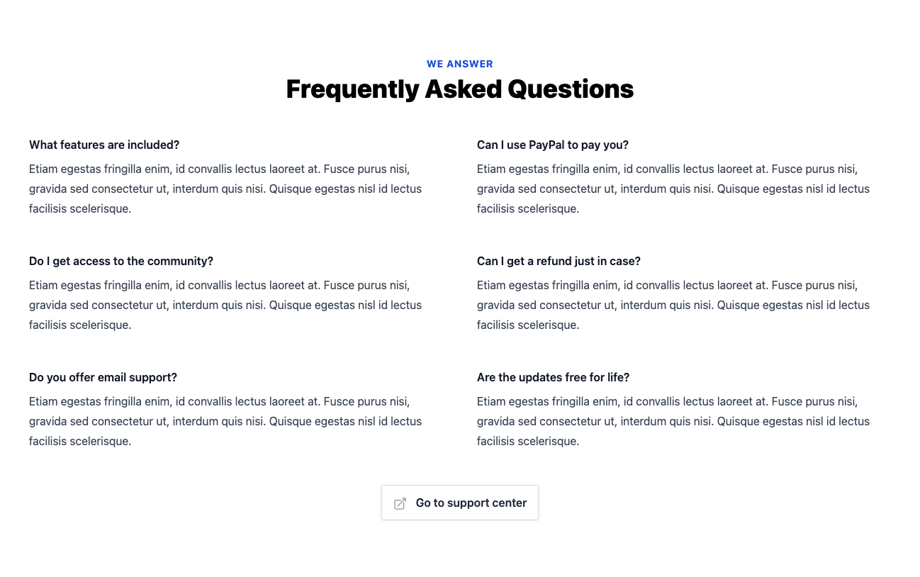
FAQ with 3 column grid and blocks
Get the code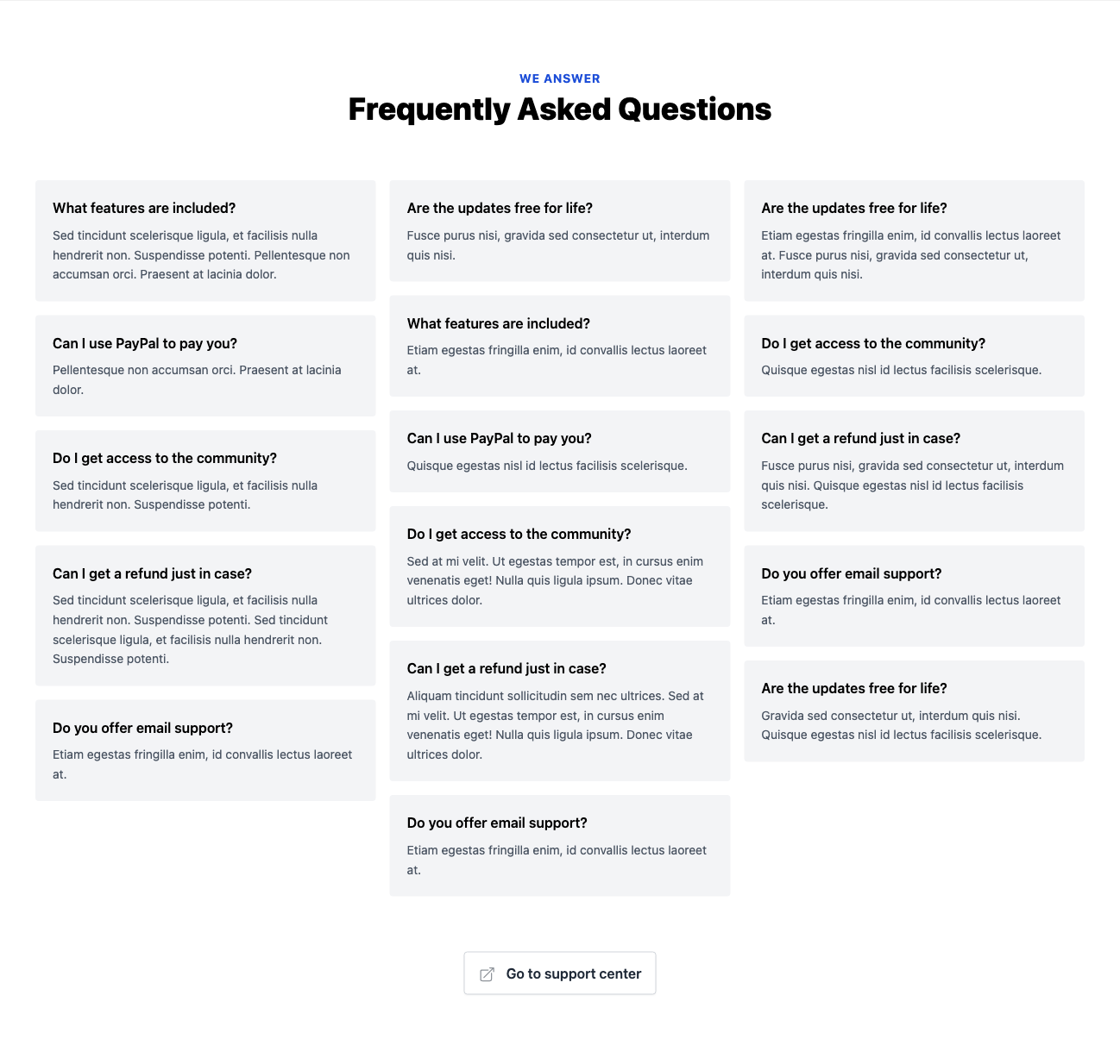
Newsletter with centered form in block with decorations
Get the code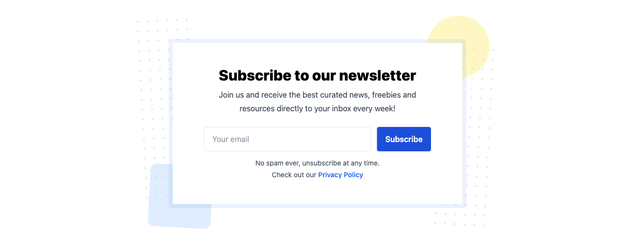
Newsletter with image and right aligned form
Get the code
Features in two column grid with icons and decorations
Get the code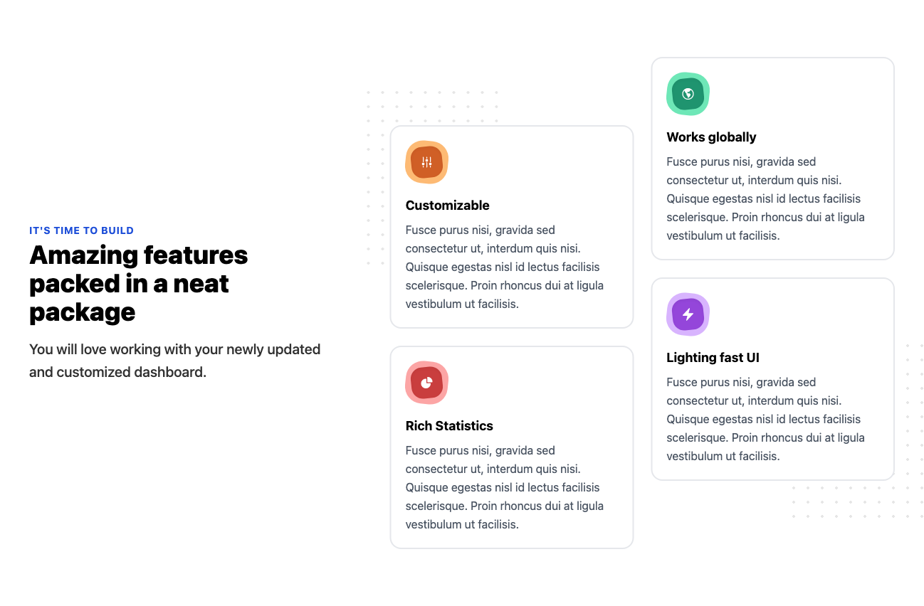
Features in three column grid with icons
Get the code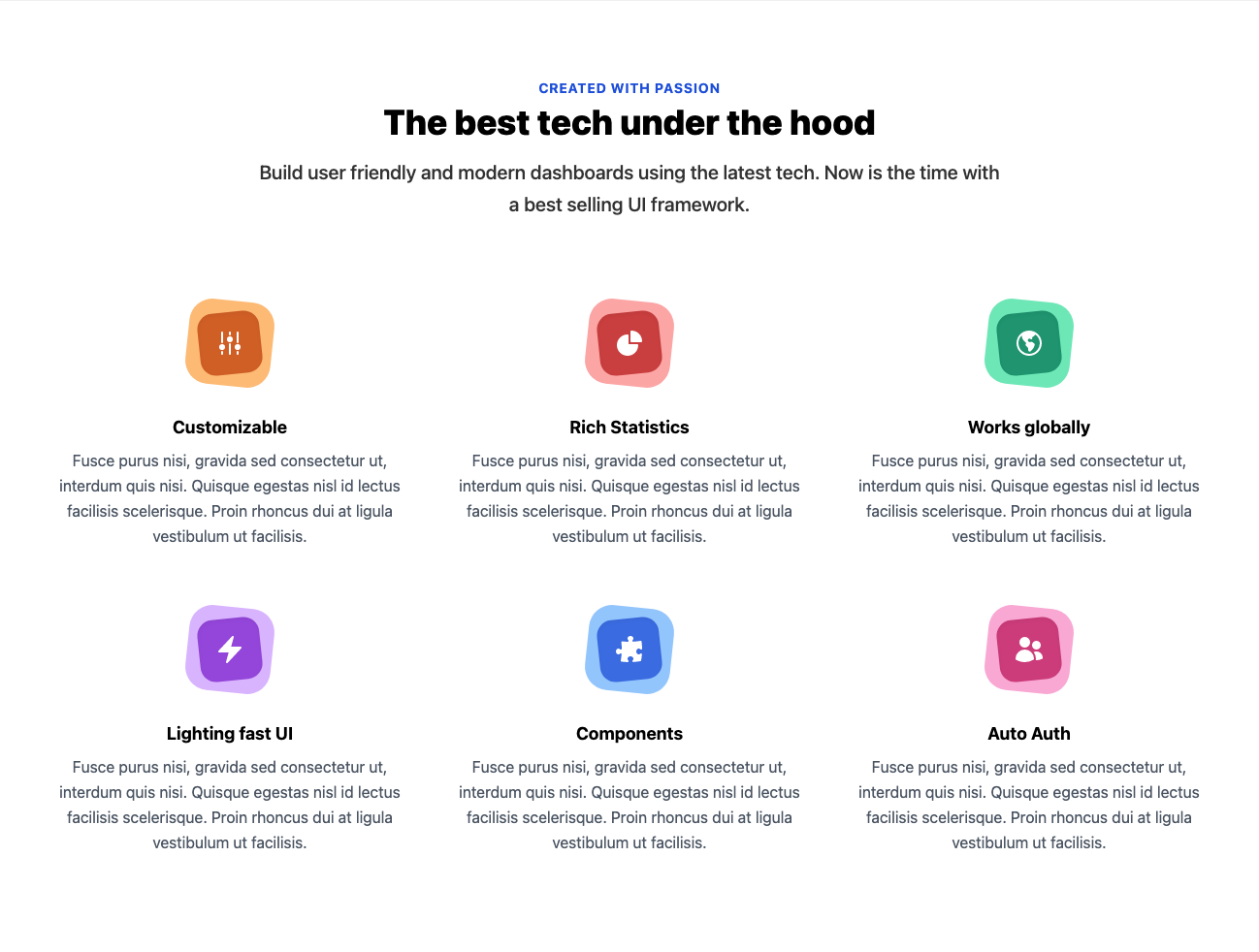
Clients with logos in 3 column grid
Get the code
Blog posts in 3 column grid with header image, title, description, and tags
Get the code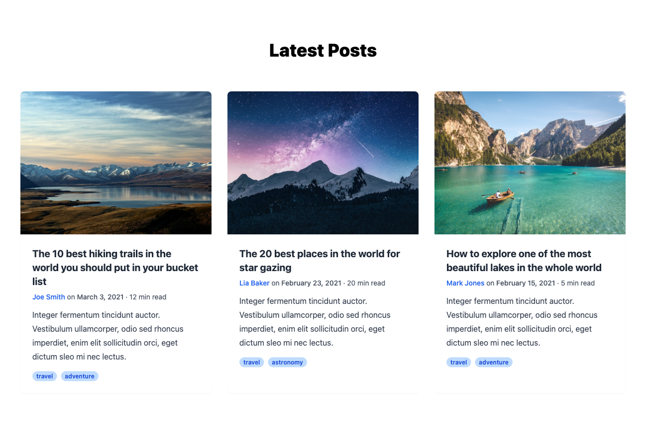
Testimonials with avatar
Get the code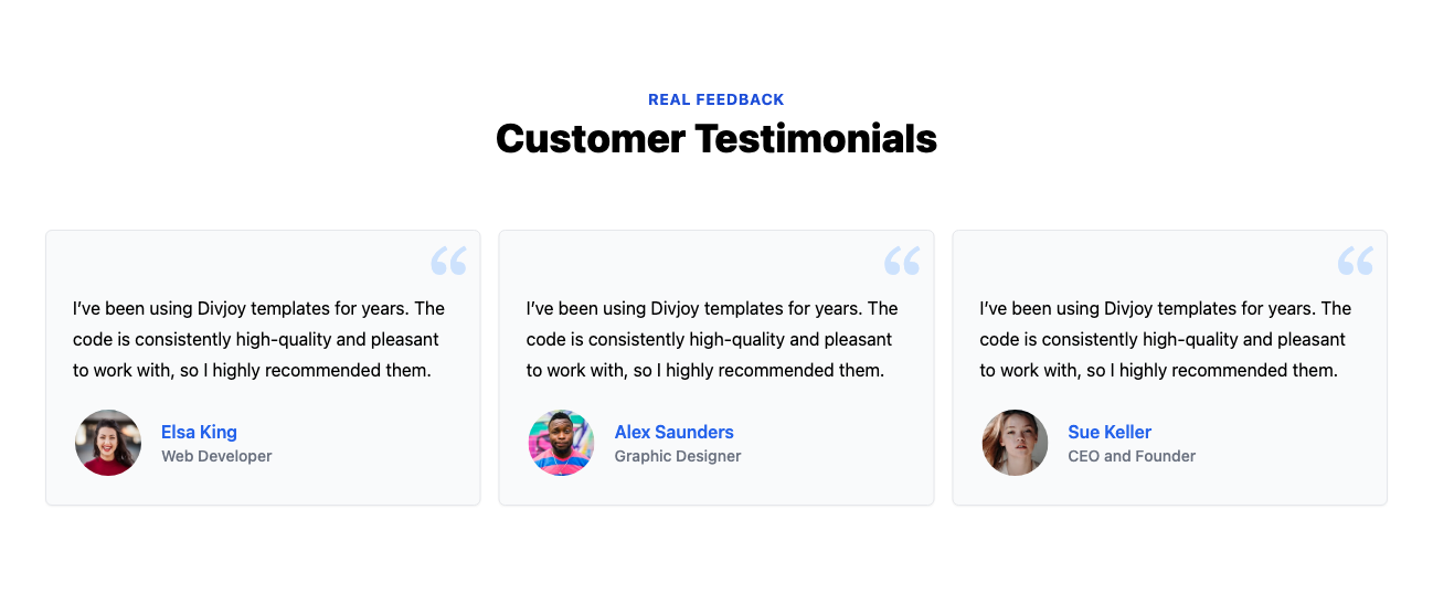
Single large testimonial with avatar and stars
Get the code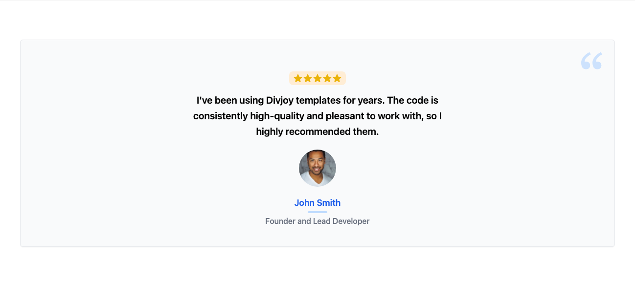
Team bios with full portrait image and hover effect
Get the code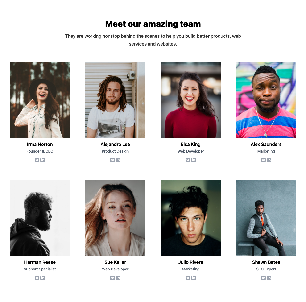
Team bios with round images in grid
Get the code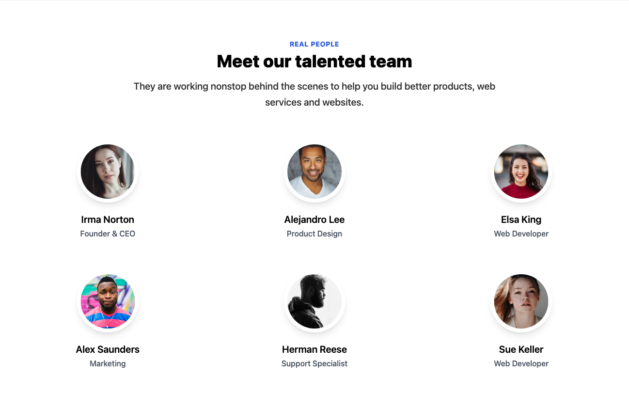
Stats row with header and numbers
Get the code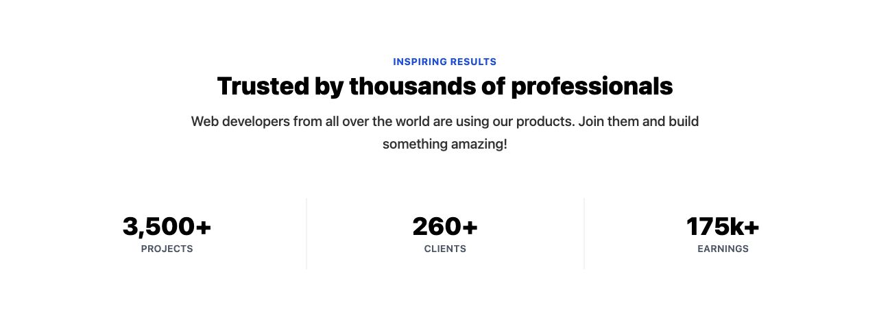
Stats row with numbers, icons, and clickable cards
Get the code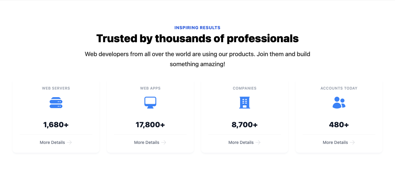
Pricing with 3 plans and feature list
Get the code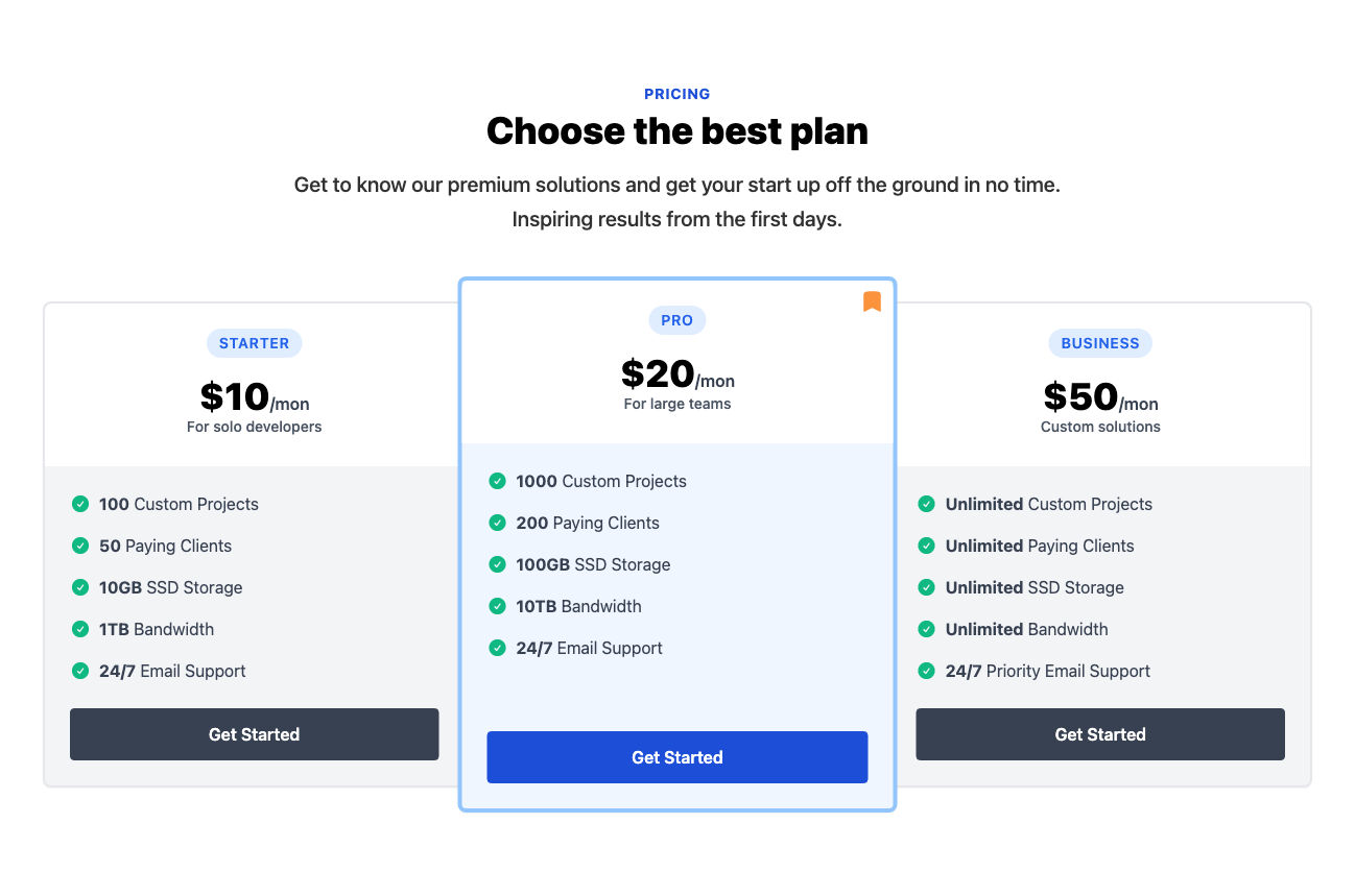
Pricing with single plan and feature list
Get the code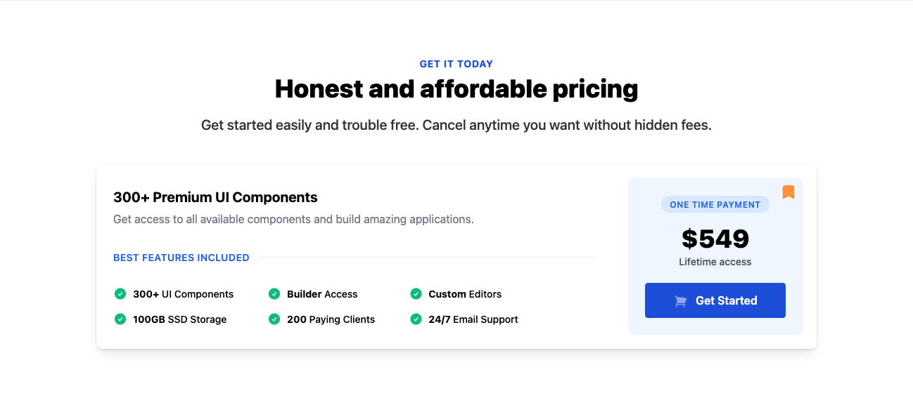
Contact form with decorations
Get the code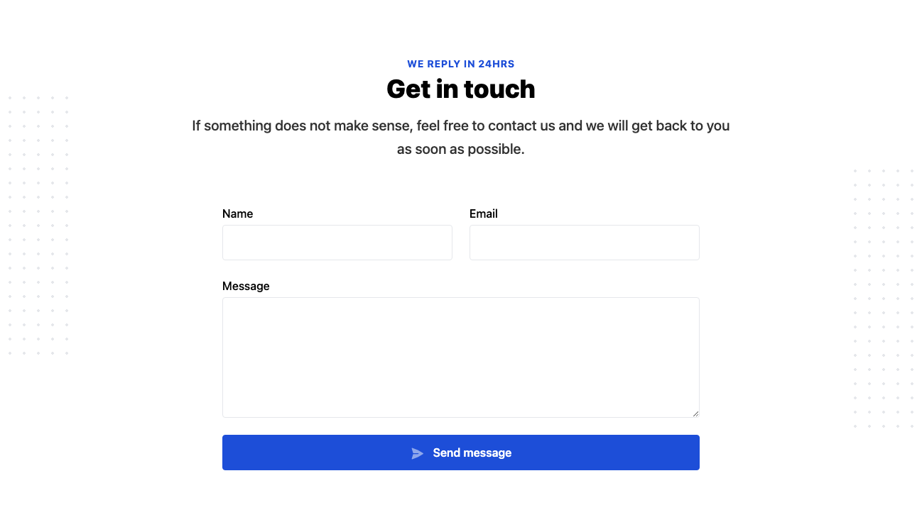
Contact form with image background and left aligned company details
Get the code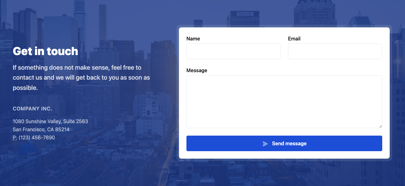
Footer with 3 columns, social links, and newsletter form
Get the code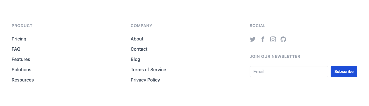
Footer with row of links
Get the code
Get the code
You can get the code for this component in our React and Tailwind Boilerplate. You'll get a complete React codebase with Tailwind integration, a beautiful multi-page template, additional integrations if you need them (like auth and payments), and access to our entire Tailwind component library.

 Twitter
 Facebook
 Linkedin
 Discord